

Quick Summary
This blog outlines seven essential architecture tips for building an effective web dashboard for massive datasets. By prioritizing user-centric design, data visualization, and responsive layouts, businesses can enhance their web application development, turning complex data into actionable insights for improved decision-making and growth.
Introduction
The main challenge of an effective web dashboard for huge datasets is to make complex data actionable, hence quite a challenge. However, the right architecture and design principles can simplify it. Partnering with a skilled web application development company can ensure that your dashboard is built with efficiency, scalability, and user experience in mind, allowing you to turn complex data into actionable insights seamlessly.
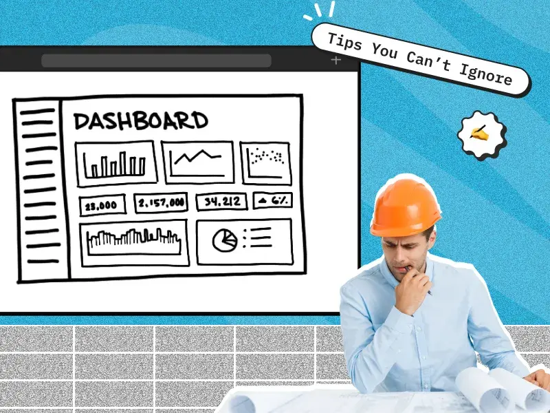
7 Essential Architecture Tips for Building the Perfect Web Dashboard for Massive Datasets
1. User-Centric
To create an effective dashboard, it’s essential to put the user at the center of your design. By conducting thorough user research on their goals, preferences, and technical capabilities, you can ensure that the dashboard meets their needs. Partnering with an experienced web application development company can help in crafting user personas that guide key design and functionality decisions, leading to a more intuitive and user-friendly interface. Whether it’s a corporate dashboard or a customer-facing application, understanding your user’s behavior ensures a tailored experience.
Read more: Reactjs V/s Angularjs: Choose better for your Application
2. Data Prioritization
This requires positioning the most strategic and frequently used data elements at the most significant locations when you develop a dashboard for large datasets. It is worth tapping the modern web application architecture principles to make sure the metrics are as fronted and visible to the user.
In a well-designed dashboard, clarity and order are key. An expert web application development company can ensure that the layout avoids unnecessary clutter while focusing on the most actionable data. Too many charts or visual elements can overwhelm users; instead, ensure that the dashboard highlights only the most valuable data for a clear,
3. Apply Information Hierarchy
Use F and Z reading patterns to direct the user’s eyes to the most important information first. Use size and placement to emphasize what is important and readable. For instance, a web application development company might place high-priority data points in the top-left corner, where users naturally look first. Consistency in element sizes and positioning can also help users navigate the dashboard more intuitively, ensuring they can easily scan and interpret the data. By working with a team experienced in web application development services, you can apply these visual patterns effectively, improving the overall user experience.
4. Data Visualization Architecture
Data visualization plays a crucial role in making your dashboard user-friendly. Selecting the right types of charts and graphs is vital, and keeping visual clutter to a minimum is a must. By leveraging web application development services, you can create effective data visualization architectures that present complex data in an easily digestible way. Whether it’s bar graphs or line charts, a web application development company can help you apply the data-ink ratio technique to focus only on relevant information, making your data easy to understand at a glance.
5. Responsive Design
A dashboard must respond to all kinds of devices available and varying screen sizes; this will thereby enhance usability and access of the clients to key insights at any time on any device. A responsive design puts the focus of the user specifically on certain facts while allowing control over which data is shown, thus enhancing the overall experience of the user.
For CEOs looking for scalability and efficiency, incorporating Object Oriented Web Application Design is key. This approach breaks the dashboard design into modular, reusable components, allowing for easier updates and customizations. By leveraging this design method, CEOs can ensure their dashboard is both adaptable to different devices and structured to handle future growth, offering a perfect fit across various screen sizes, from desktops to mobile devices.
6. Progressive Disclosure
The best way to avoid clutter is through progressive disclosure, or showing information in layers. This technique layers information, allowing users to drill down into more detailed data as needed. An experienced web app development company can ensure that this approach improves the user experience, providing clarity and reducing the likelihood of errors. By incorporating web application development techniques that focus on progressive disclosure, you can maintain a user-centric design while allowing users to access deeper data insights when necessary.
7. Ensure Maintainability and Scalability
A modular approach is essential when you develop a dashboard that is both scalable and maintainable. A modular approach to web application development ensures that new features or data sources can be added without disrupting the existing system. By working with a web app development company, you can build a future-proof solution that can adapt as technologies and data needs evolve. Performance optimization techniques such as caching and lazy loading, offered by professional web application development services, can reduce load times and enhance dashboard performance.
Read more: From Bugs to Business Growth: How Sentry Transformed Our Clients’ Digital Experiences
Conclusion
Building the perfect web dashboard for large datasets requires a deep understanding of user needs, strategic prioritization of data, and the application of modern web application development techniques. With these seven tricks implemented in your architecture for a web application, you are sure to develop a dashboard powerful yet user-friendly and efficient. This can be a good addition together with collaboration with the best web application development company to create a high-quality solution in terms of scalability.


 30 mins free Consulting
 10 min read
 Canada
 Hong Kong
 Global


 Love we get from the world